TERM 1
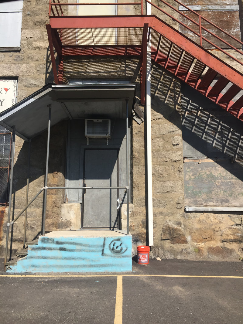
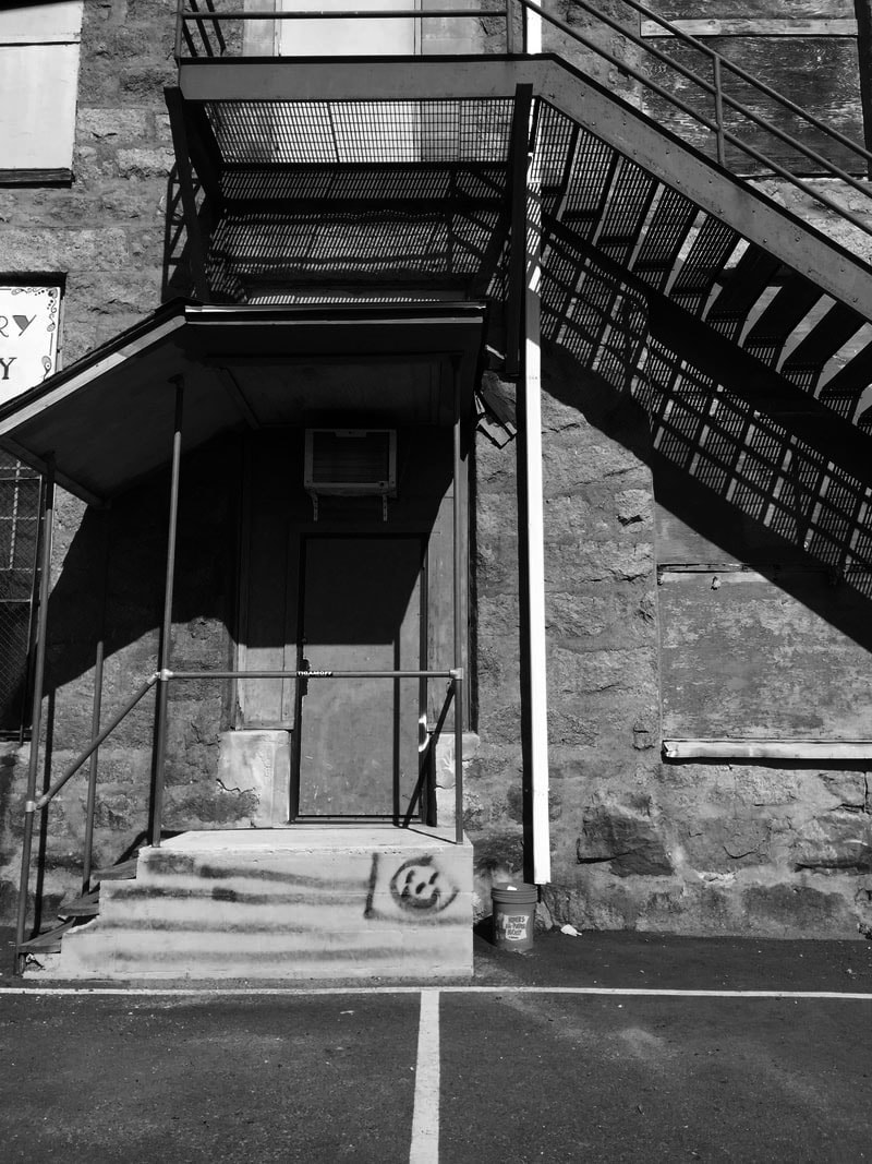
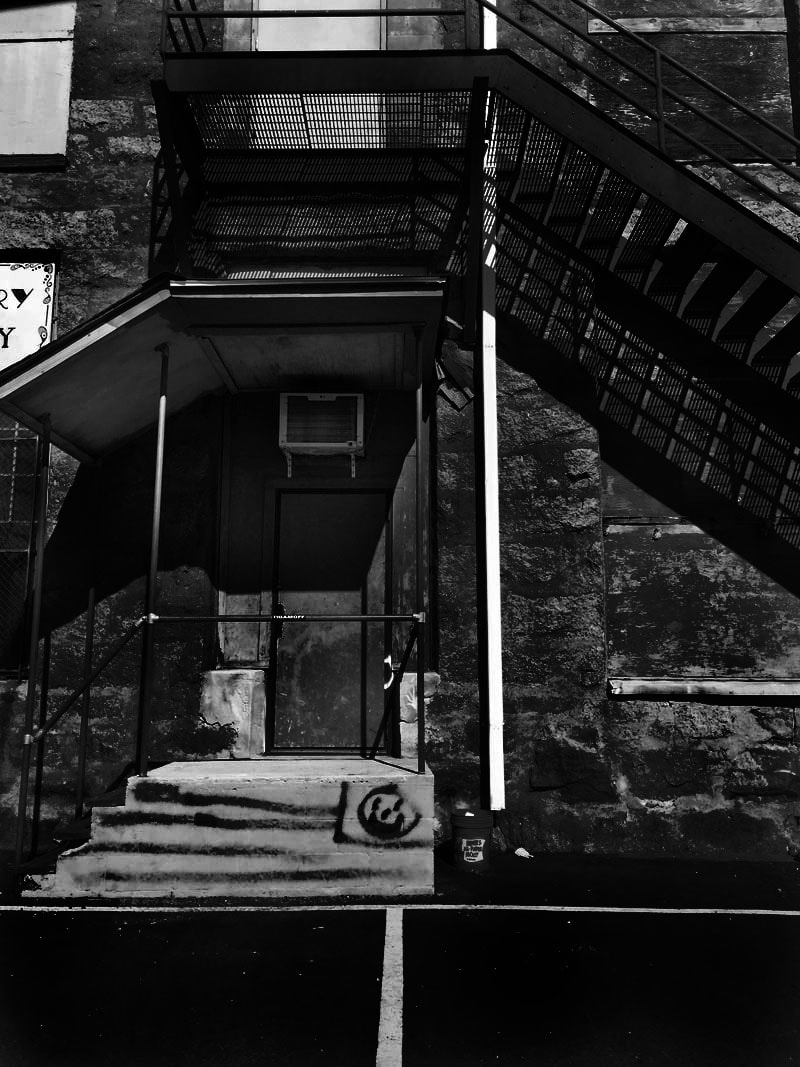
Line and Shape |
black and white
color
What locations and subject matter did you choose to shoot for your photos?
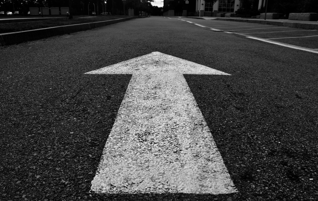
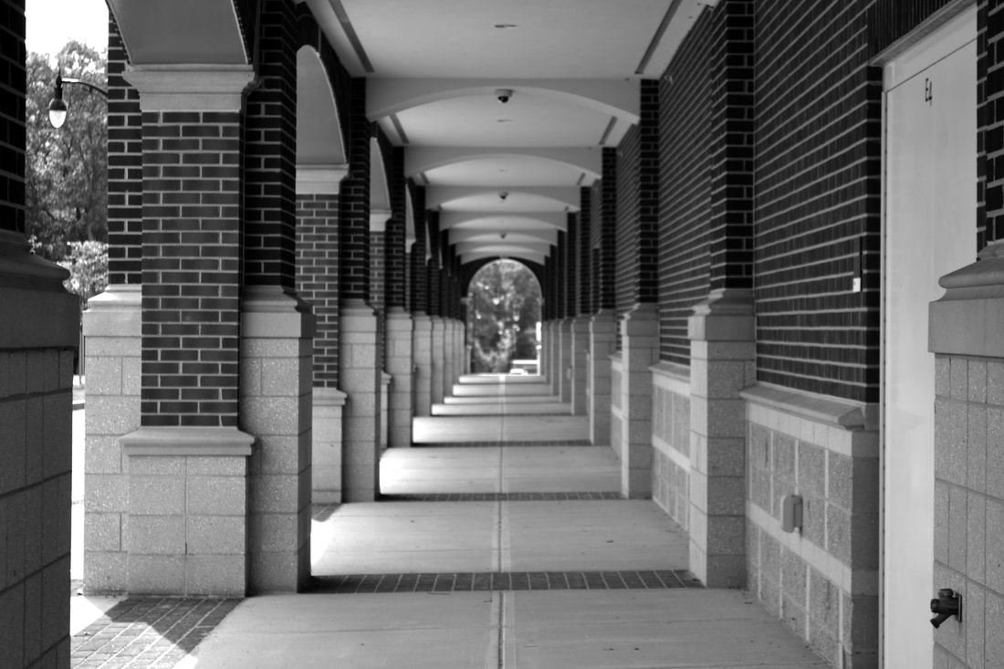
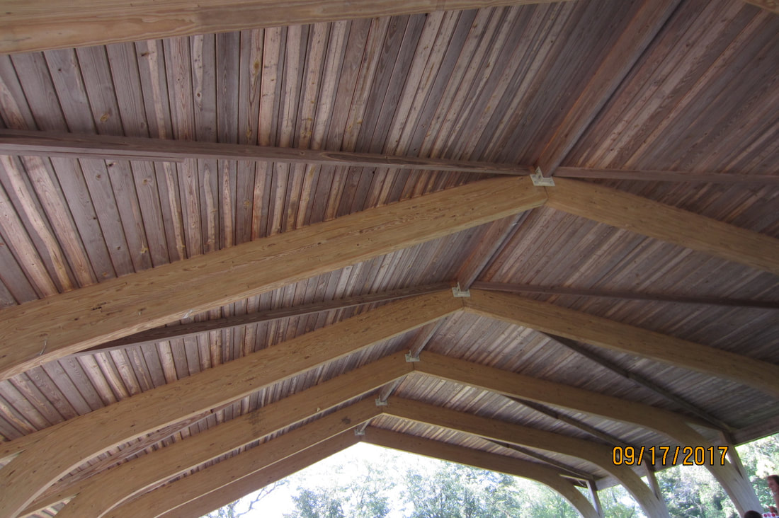
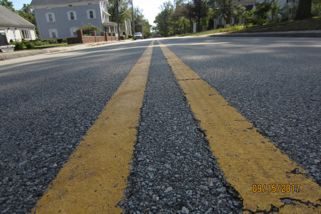
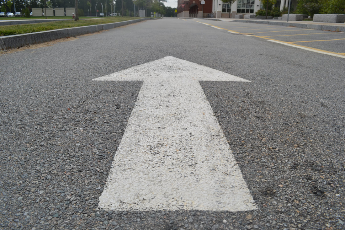
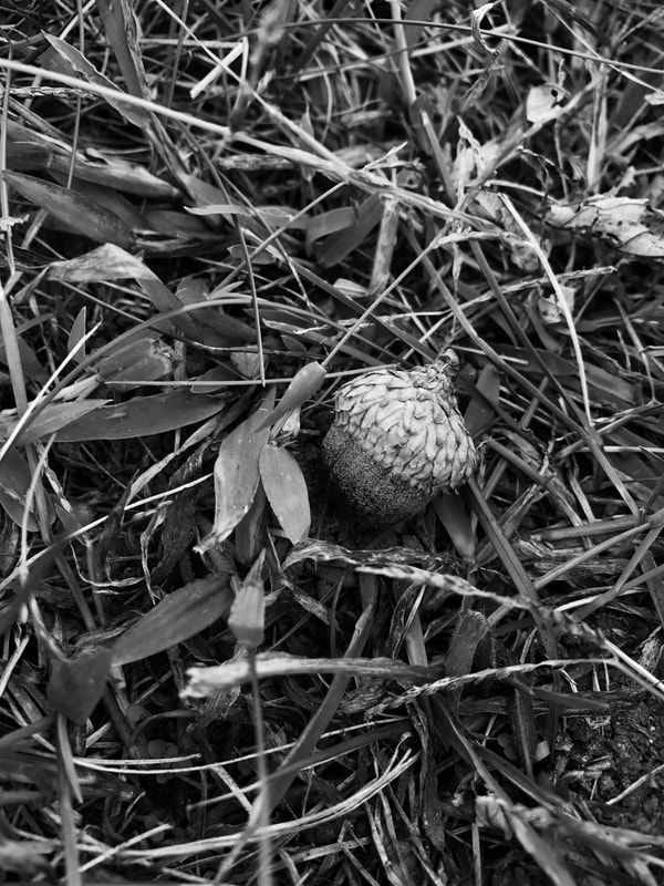
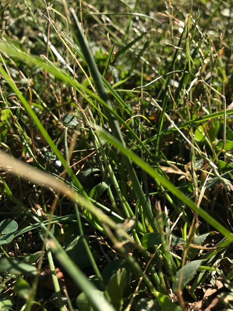
When it came to location i tried to get a lot of my pictures outside and in nature. all six of the photos i took outside of school (the first 6) were all taken outside. i also tried to get a lot of texture and close up shots because in my opinion those are some of the hardest to take and i love the look of them. the theme that stretched within all of my outside of school pictures was that they were all taken close up to nature.
Describe the photos you took:
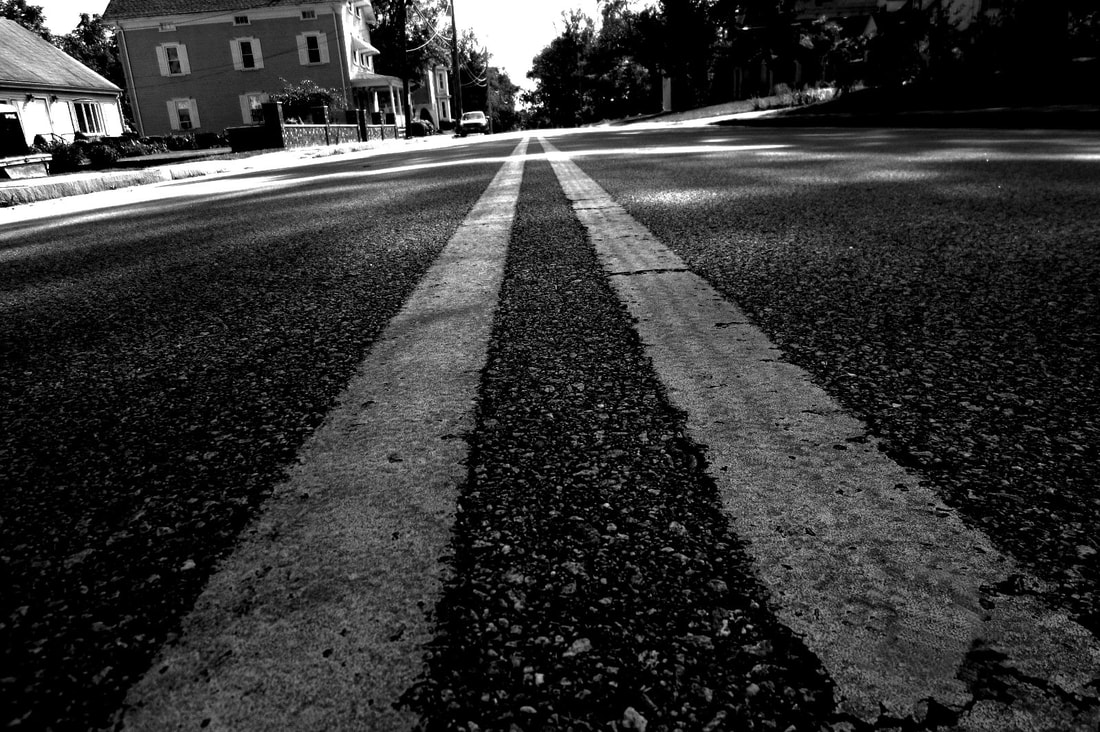
What is the distance in the shot? (How close or far away are you from your subject?)
For almost all of the photos i took i tried to get as close to the subject as i could keeping the object in focus. if i didn't get close to the subject i was trying to get as much of the object as i can, in the image, without it getting cut off.
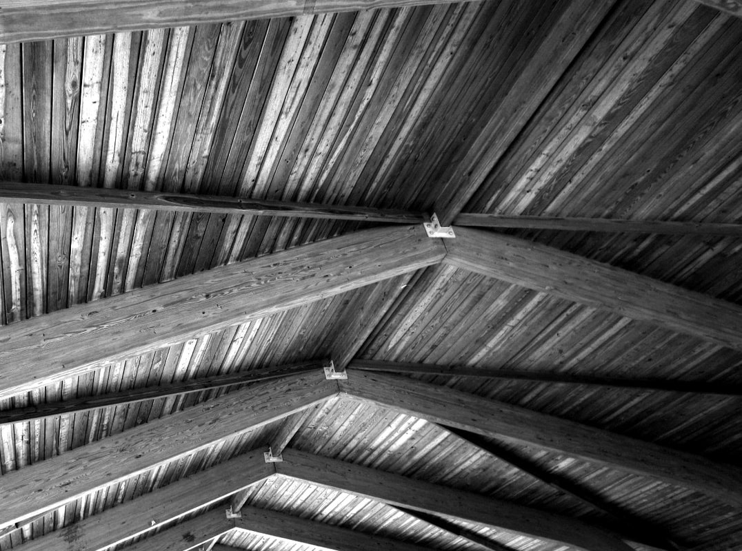
What was your point of view when you took the photos? (from above, below, straight on...)
Most of the photos i took i used a low angle facing upwards. i also used a lot of head on angles.
Are your photographs horizontal or vertical?
All of my photos were taken horizontally.
Did you consider the rule of thirds to compose your shots? In which photos? Describe.
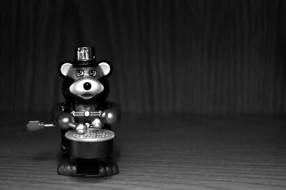
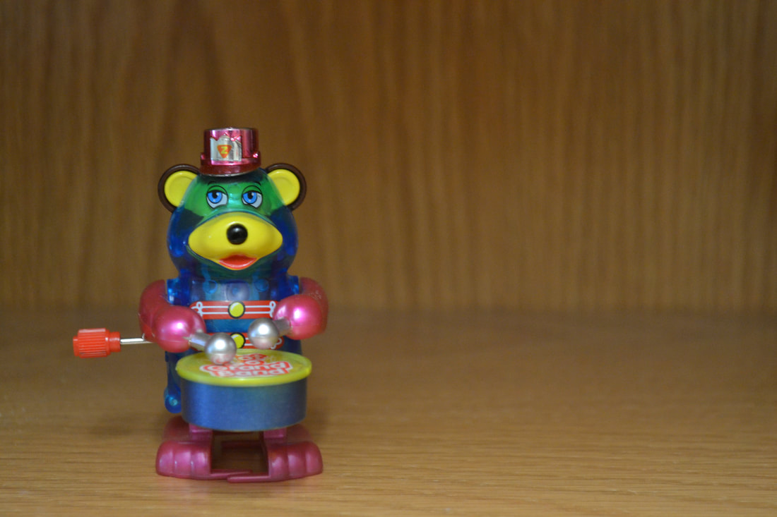
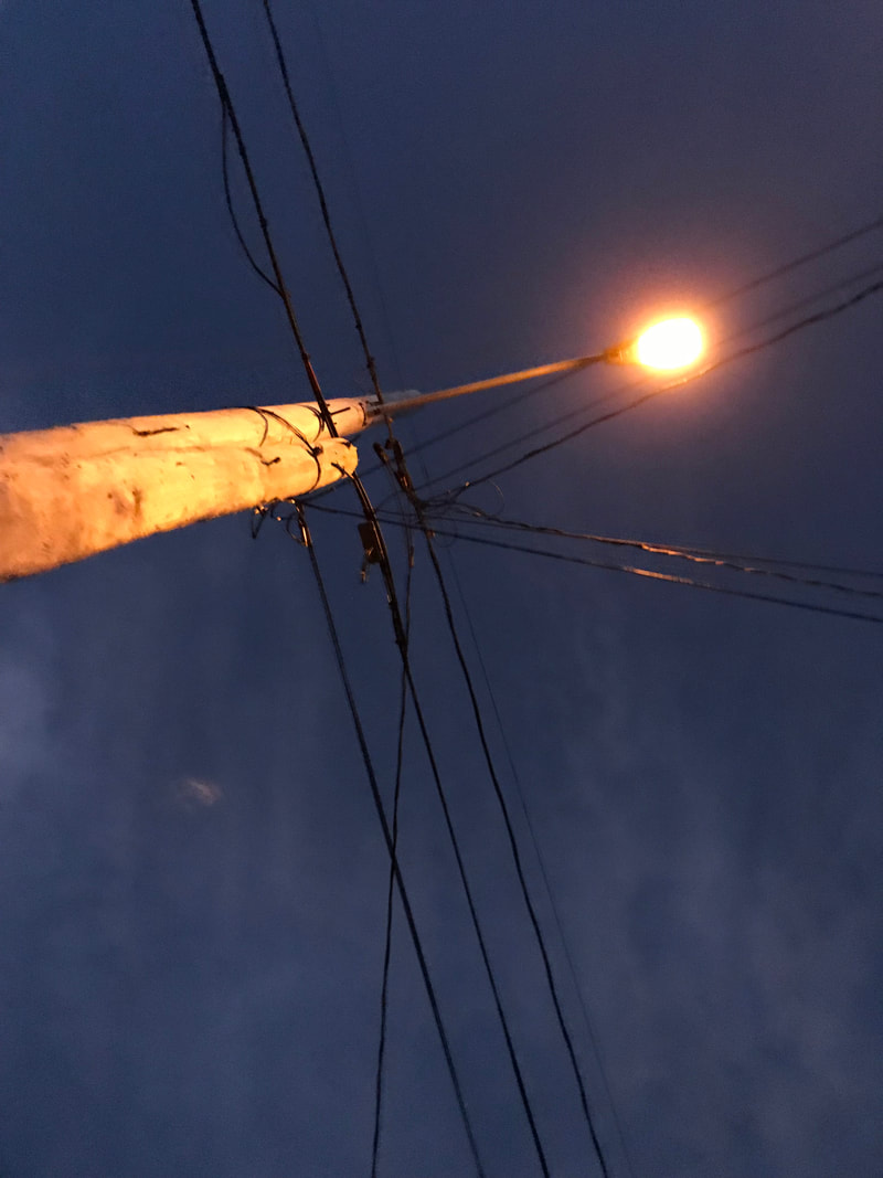
i used a lot of the rule of thirds with most of my pictures. especially in the toy bear, flower, and telephone pole photos. most of them are placed in the bottom part of the rule of thirds grid.
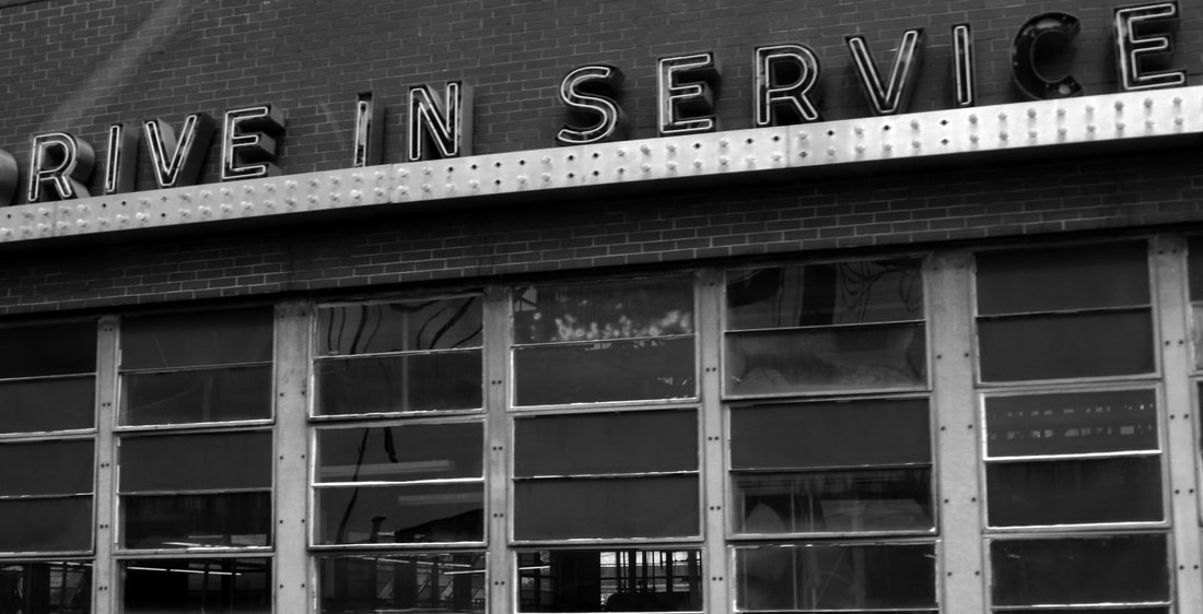
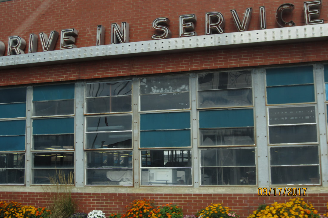
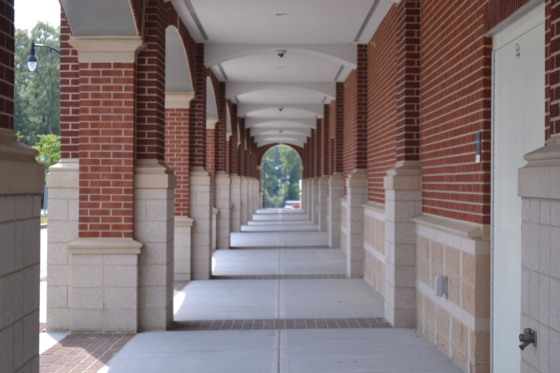
Which one of of your photos is a dynamic composition that successfully leads the viewer’s eye through the work?
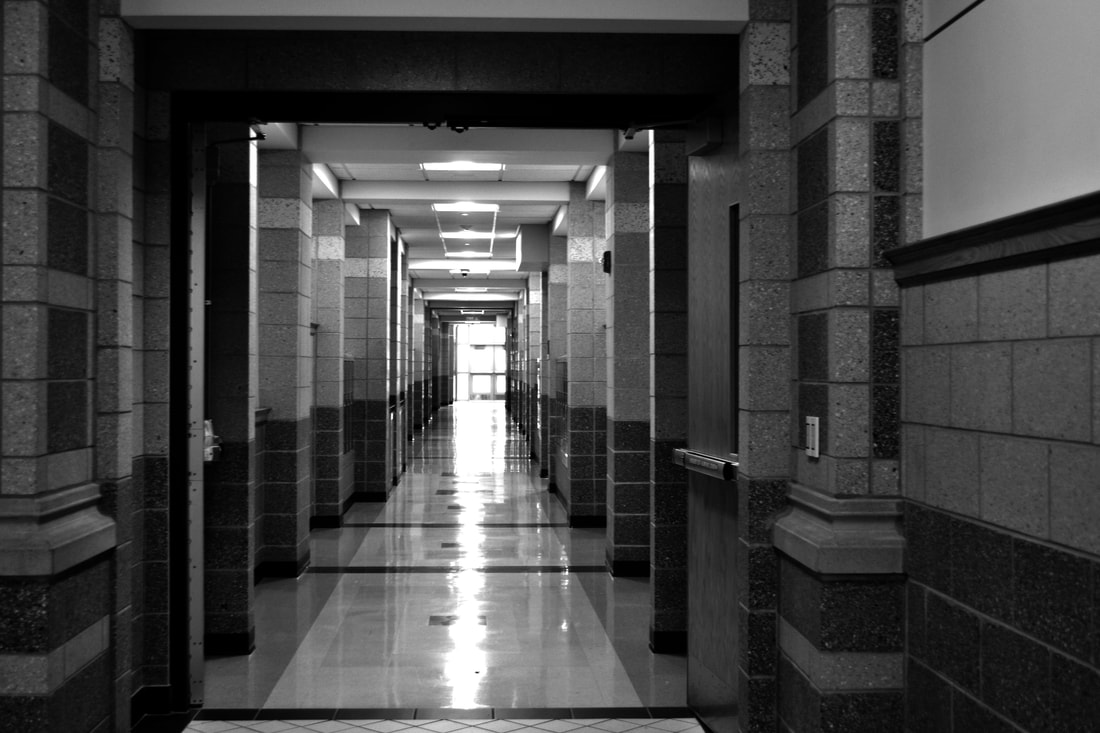
my drive in service picture is very dynamic and leads the reader across the screen to read the lettering at the top. then it leads your eye to all the windows along the side. the picture is very complex and not too busy.
When it came to location i tried to get a lot of my pictures outside and in nature. all six of the photos i took outside of school (the first 6) were all taken outside. i also tried to get a lot of texture and close up shots because in my opinion those are some of the hardest to take and i love the look of them. the theme that stretched within all of my outside of school pictures was that they were all taken close up to nature.
Describe the photos you took:
What is the distance in the shot? (How close or far away are you from your subject?)
For almost all of the photos i took i tried to get as close to the subject as i could keeping the object in focus. if i didn't get close to the subject i was trying to get as much of the object as i can, in the image, without it getting cut off.
What was your point of view when you took the photos? (from above, below, straight on...)
Most of the photos i took i used a low angle facing upwards. i also used a lot of head on angles.
Are your photographs horizontal or vertical?
All of my photos were taken horizontally.
Did you consider the rule of thirds to compose your shots? In which photos? Describe.
i used a lot of the rule of thirds with most of my pictures. especially in the toy bear, flower, and telephone pole photos. most of them are placed in the bottom part of the rule of thirds grid.
Which one of of your photos is a dynamic composition that successfully leads the viewer’s eye through the work?
my drive in service picture is very dynamic and leads the reader across the screen to read the lettering at the top. then it leads your eye to all the windows along the side. the picture is very complex and not too busy.
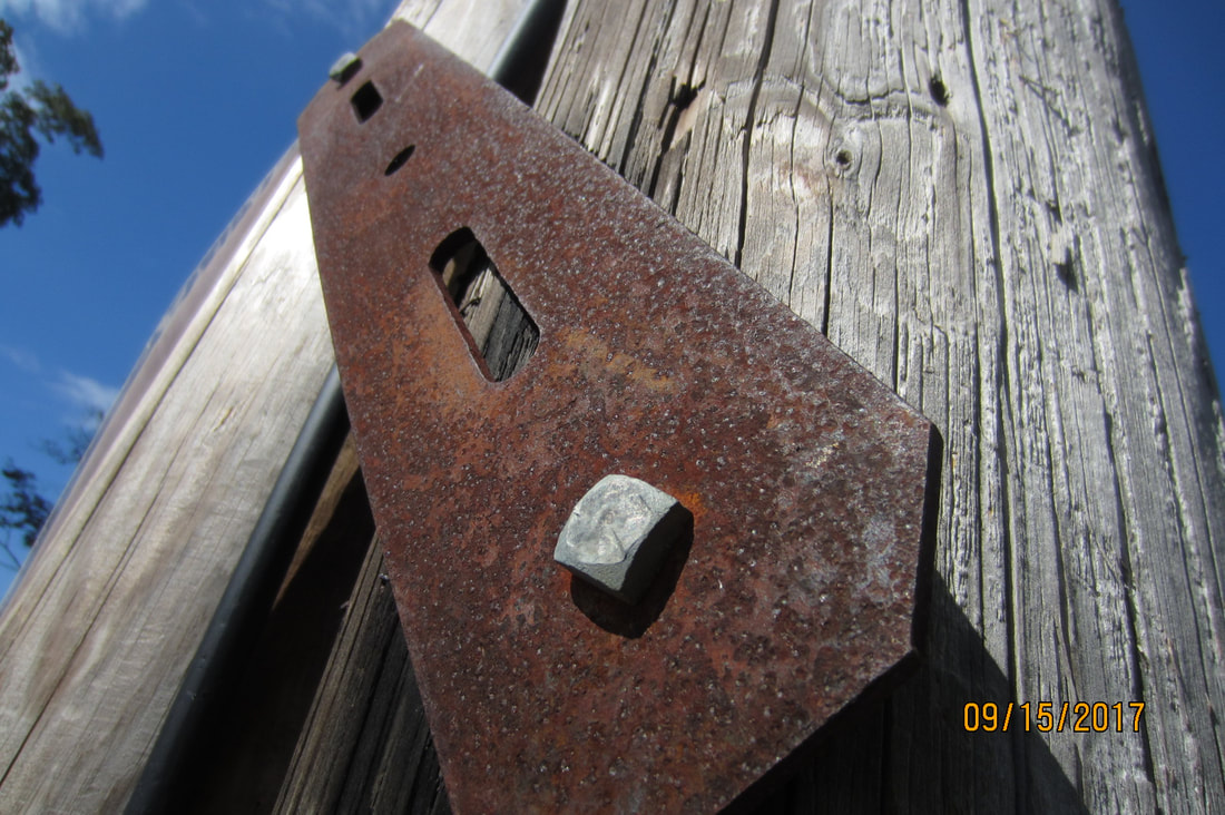
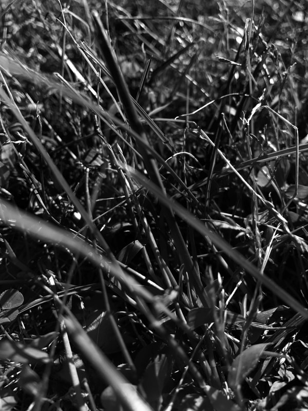
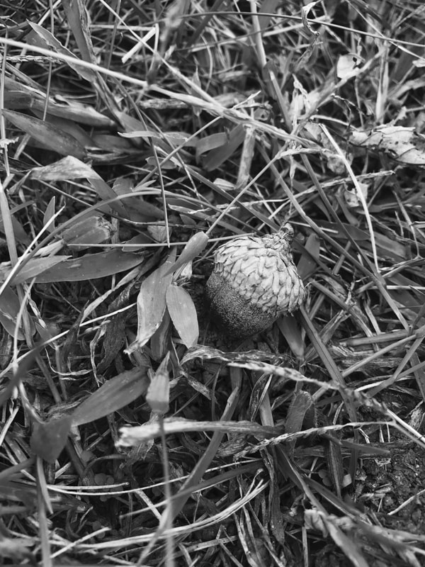
Pattern and Texture

original

Describe your best photo:
What is the distance in the shot? (How close or far away are you from your subject?)
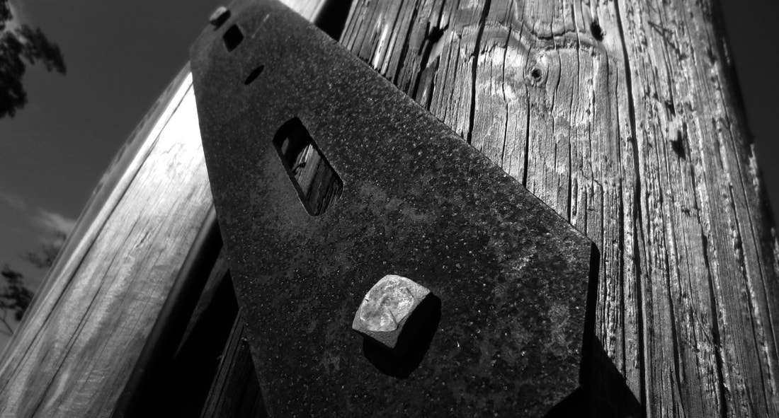
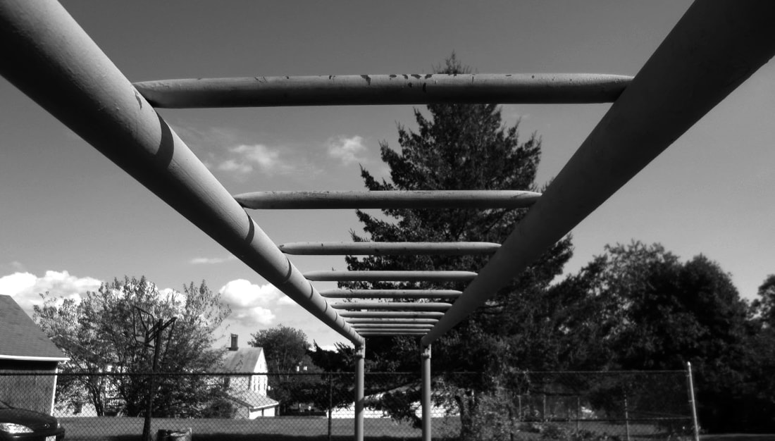
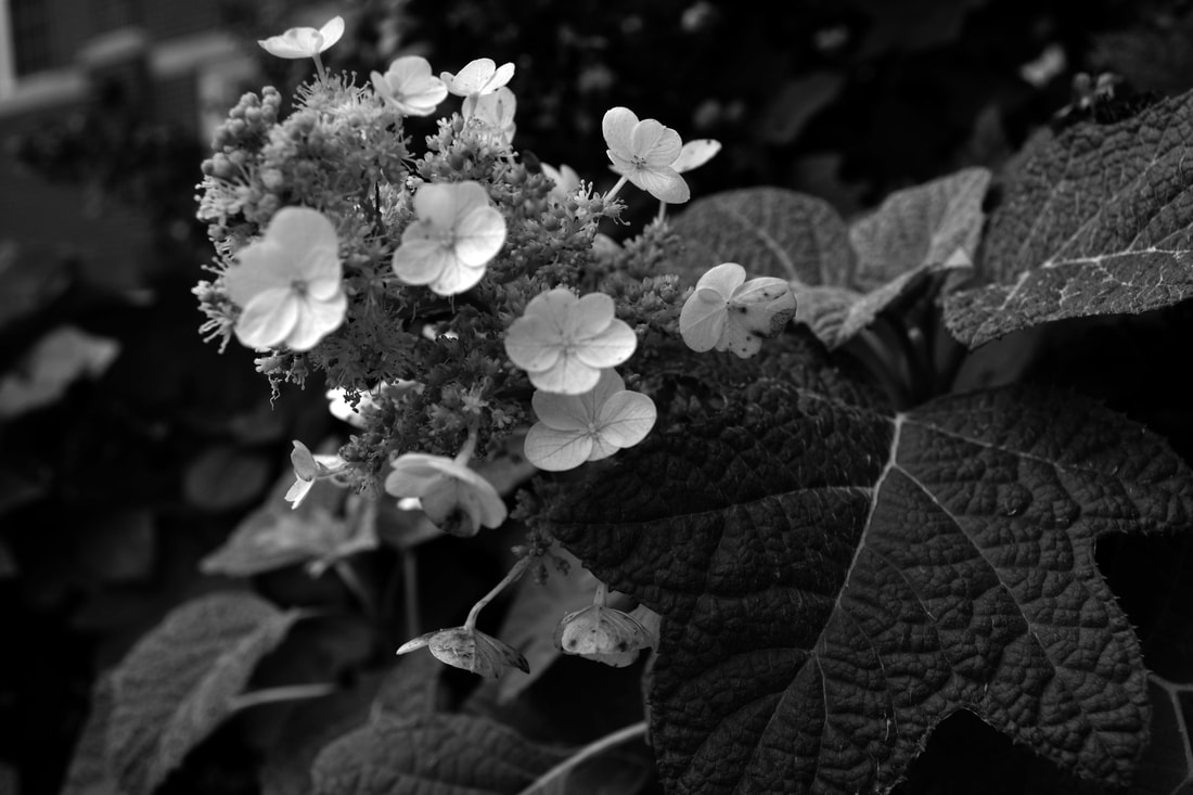
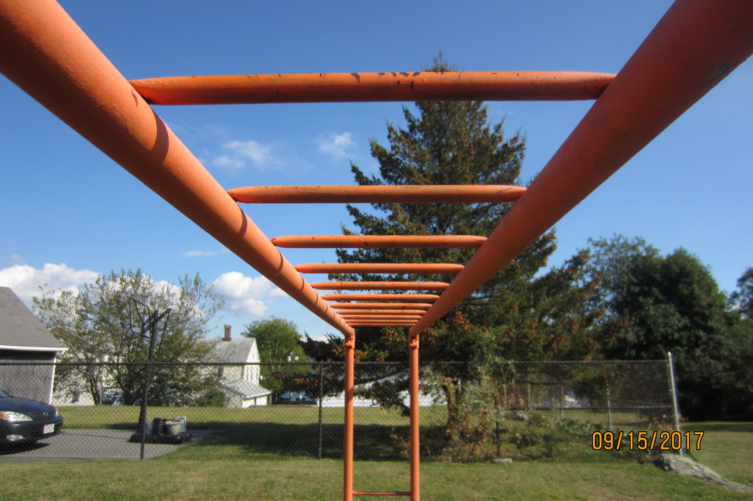
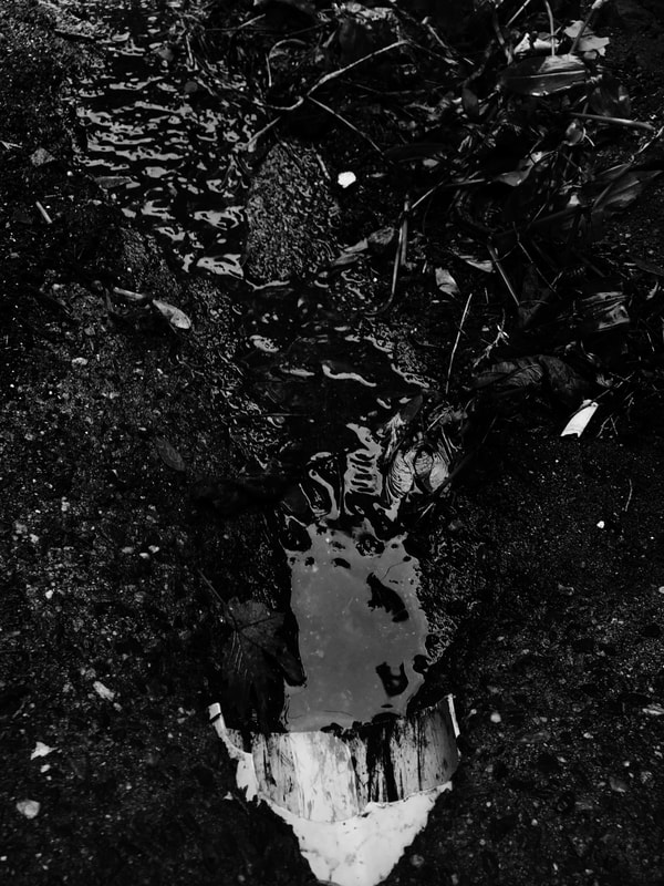
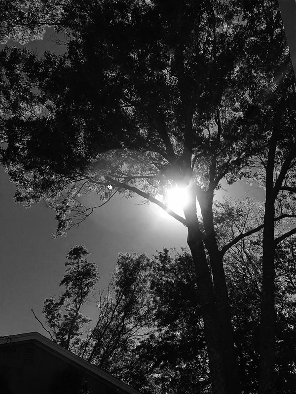
i was really close to most of the objects in these objects. the pictures of the sky were taken farther away to get all the details included in it.
What was your point of view when you took the photos? (from above, below, straight on...)
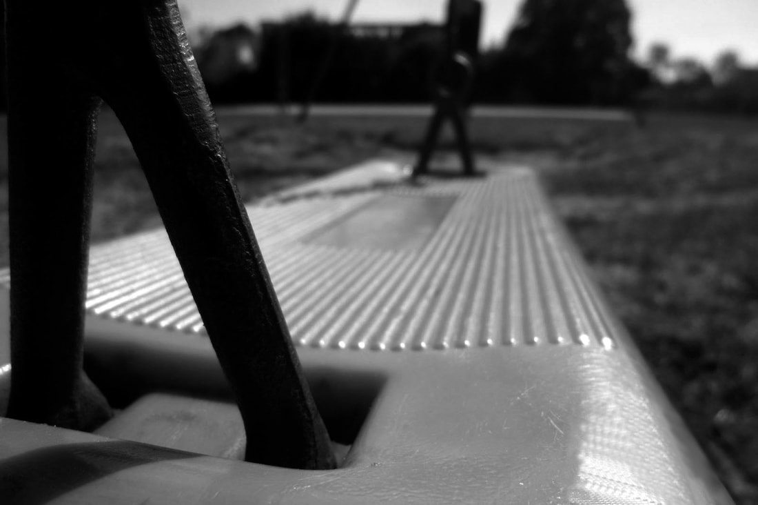
i took all my photos from a different angles, a lot of them were high angles looking down and two were very low angles looking up.
Is your photograph horizontal or vertical?Does this photo follow the rule of thirds? Why or why not? (Describe).
i always try to take horizontal photos, i find that fits everything nice. for this project, i took a couple photos that looked better vertically like the PVC pipe one. these photos don't really follow the rule of thirds, most of these i thought looked more pleasing centered in the middle.
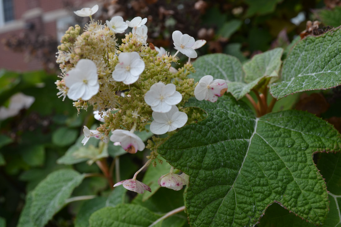
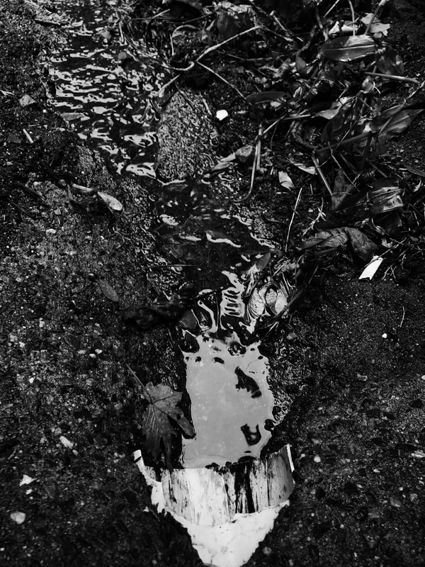
Is this photo an example of pattern, texture and/or rhythm? Explain.
the picture of the PVC pipe was very textured because of the cement and leaves, there is rhythm in the water, and patterns in the details of the leaves.
Proper Exposure:
In changing your photos to black and white, we have adjusted the levels in your photos with consideration of the highlights, midtones and shadows.
Examine your photos and answer the following questions:
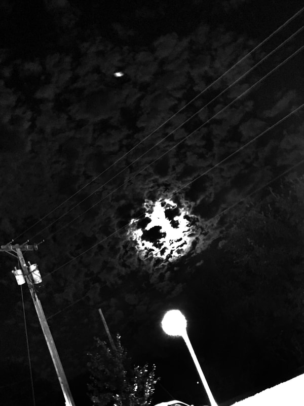
Which image may be overexposed? (too bright) Why? Which area/areas is/are too bright?
i do not think any of my photos are overexposed, i tend to make most of my photos too dark. it could be a little overexposed in the area of the sun and moon but there is no way to go around that with an iPhone.
Which image is underexposed? (too dark) Which area/areas is/are too dark?
i always tend to make my photos too dark but i think that it is pleasing to the eye way more than if an image is overexposed.
Which image is the best example of a properly exposed photo? Explain why.
i believe my image of the PVC pipe is the best exposed. there is some really white areas as well as black areas.
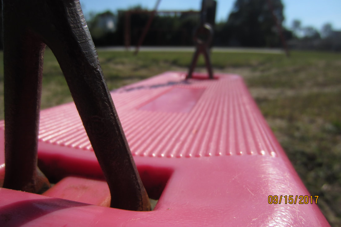
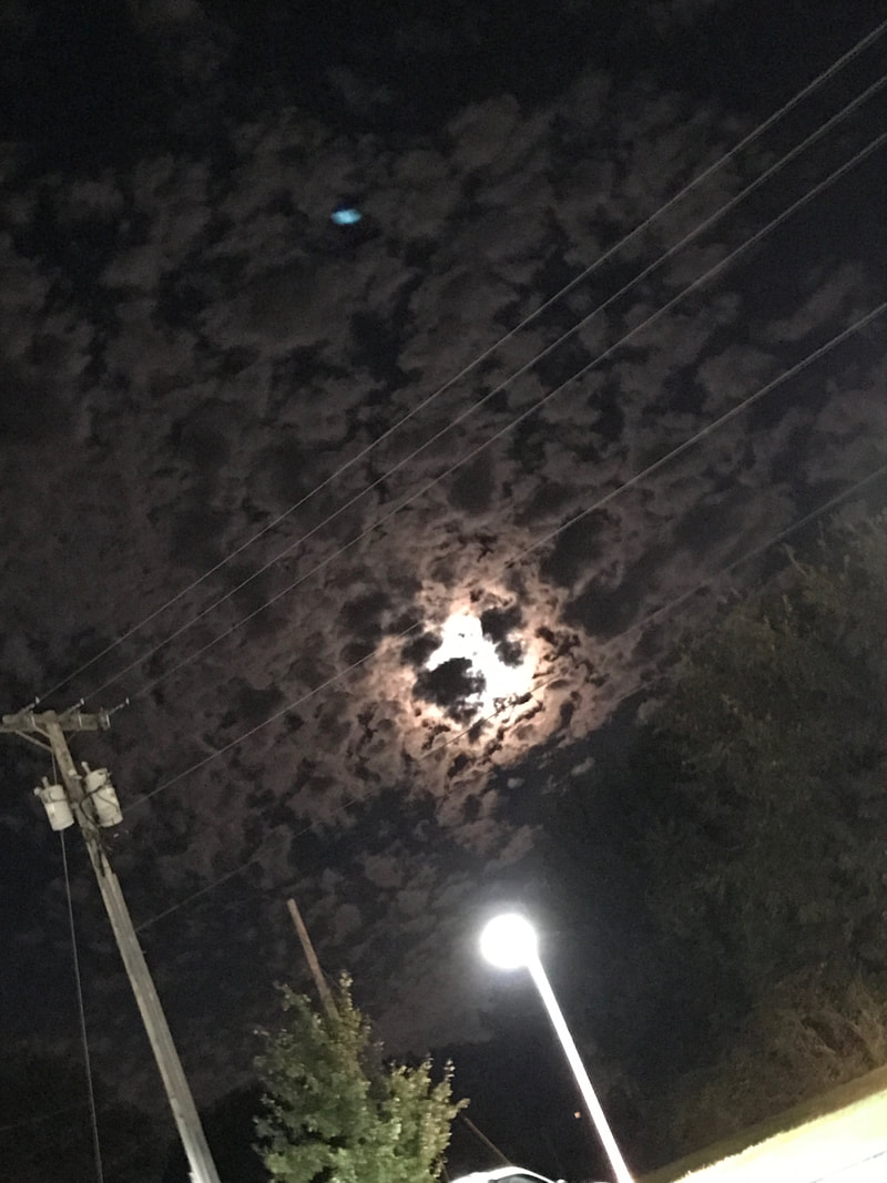
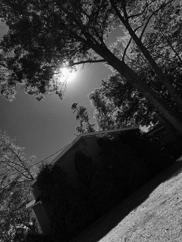
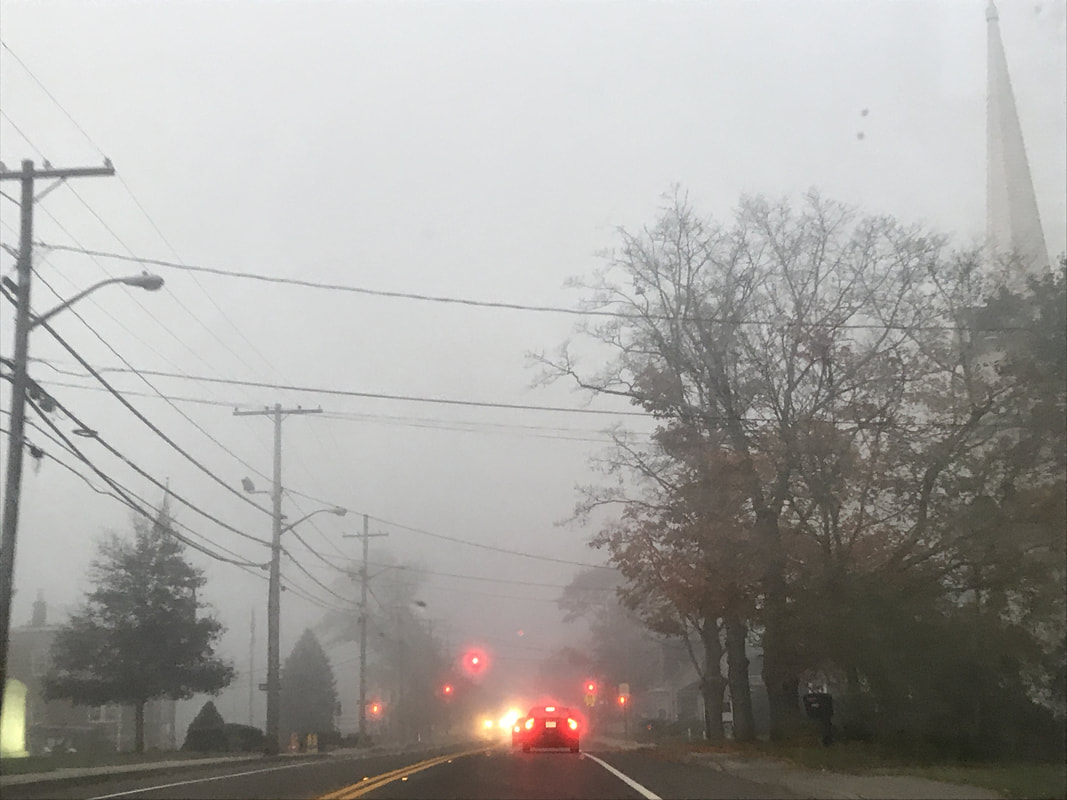
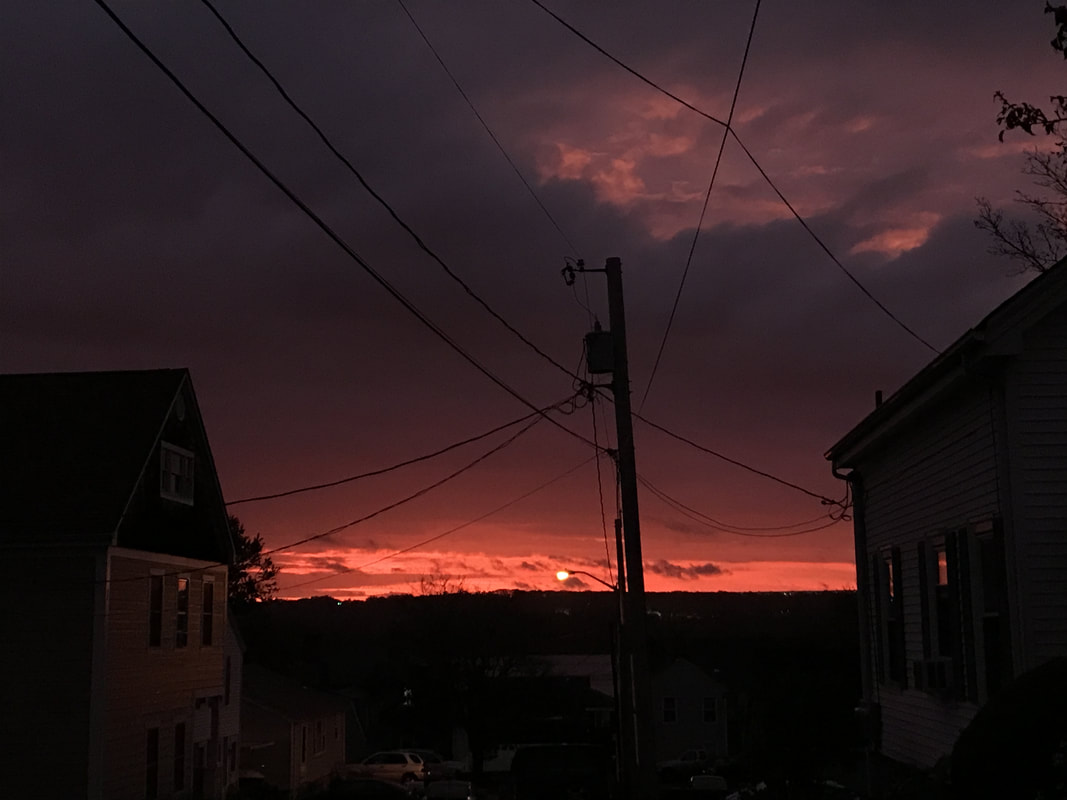
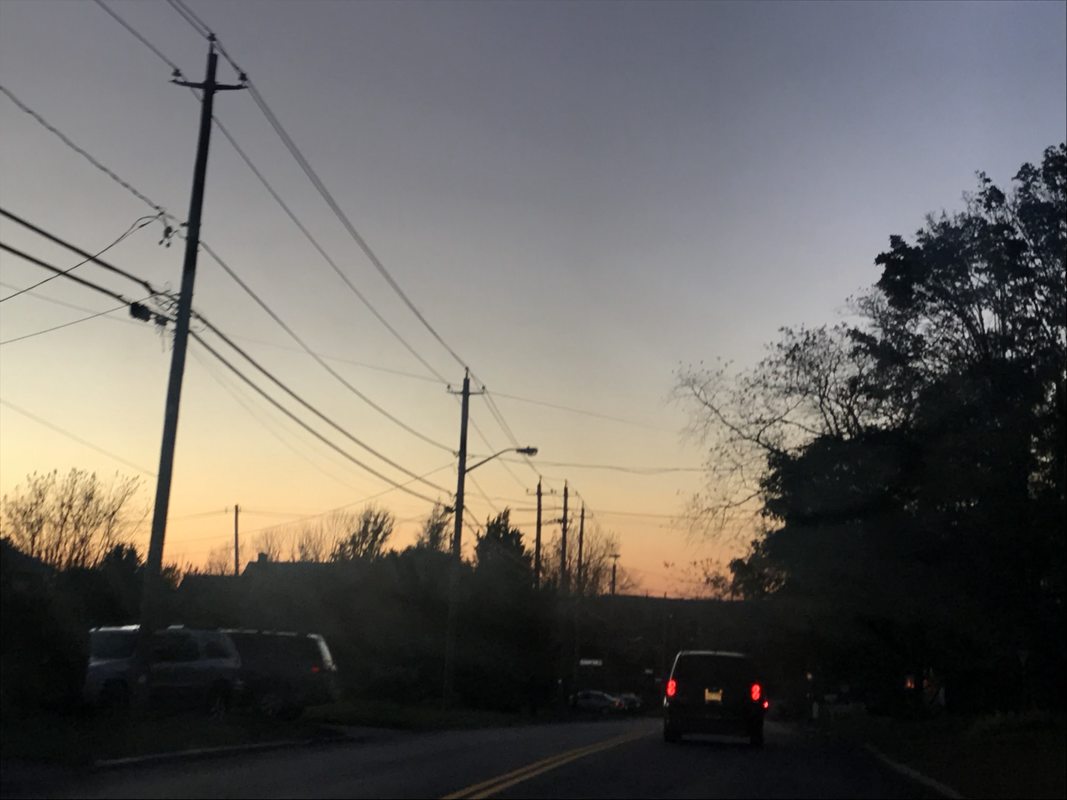
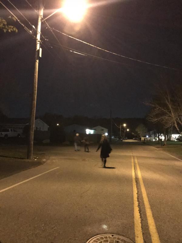
Playsets and Powerlines
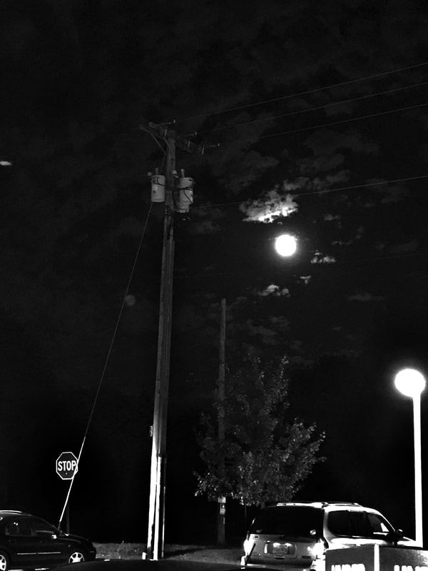
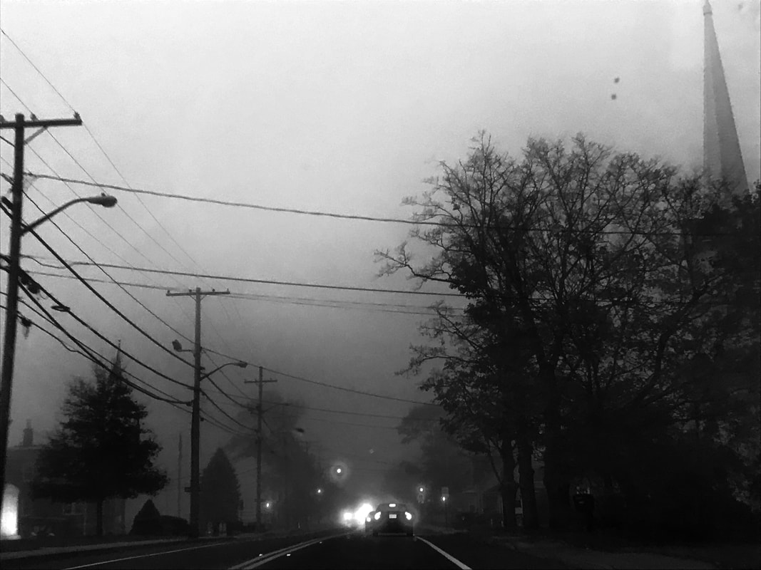
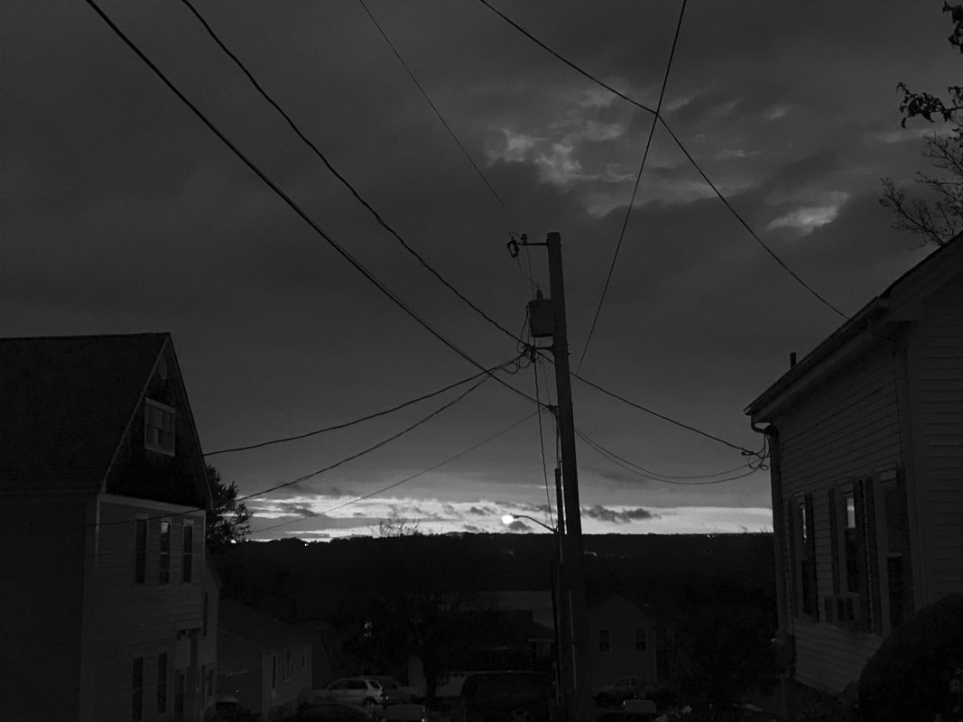
Analyze the photos that you took:
Which photo best demonstrates the rule of thirds to compose the shot? Why ?
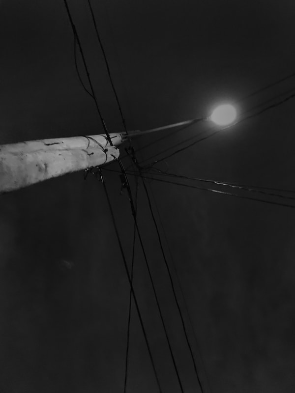
The last photo i took has the power lines and lights placed in the top left of the thirds. i think this is the best one that displays that rule.
Which photo best demonstrates consideration of distance and/or point of view? Why?
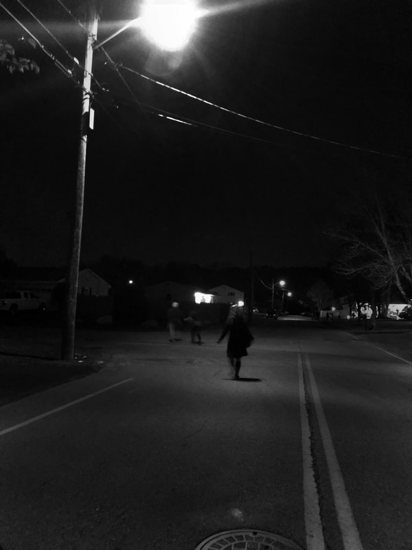
The second to last photo i took displays a good point of view look, it is of me looking at my family while trick or treating, it has a good distance from the power lines but still keeps them in frame.
Which image do you feel best showcases positive and negative shapes? How/why?
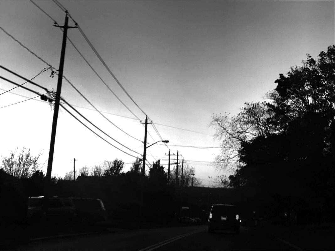
My third photo shows positive and negative shapes the best. the darkness of the surrounding buildings really make the power lines pop in the photo.
Which photo is the best example of a strong composition what successfully leads the viewers eye though the work? Describe/ Explain.
My second photo does a good job at leading your eye through the piece. there is a lot in the photo that the viewer can easily look around and see buildings, cars, and most importantly, power lines.
Which image do you feel best satisfies the assignment, or showcases what you have learned about composition this term? Why? and/or Explain...
The last photo i took is the best representation of the assignment. it has a good distance, and makes sure that the power lines are the main focus of the piece and not anything else, something i lacked in other photos.
Finally, which photo is the best example of a black and white photo with proper exposure? Explain.
I don't think any of my photos have the proper exposure, they are all dark due to the lighting from the time of day or the weather.
Which photo best demonstrates the rule of thirds to compose the shot? Why ?
The last photo i took has the power lines and lights placed in the top left of the thirds. i think this is the best one that displays that rule.
Which photo best demonstrates consideration of distance and/or point of view? Why?
The second to last photo i took displays a good point of view look, it is of me looking at my family while trick or treating, it has a good distance from the power lines but still keeps them in frame.
Which image do you feel best showcases positive and negative shapes? How/why?
My third photo shows positive and negative shapes the best. the darkness of the surrounding buildings really make the power lines pop in the photo.
Which photo is the best example of a strong composition what successfully leads the viewers eye though the work? Describe/ Explain.
My second photo does a good job at leading your eye through the piece. there is a lot in the photo that the viewer can easily look around and see buildings, cars, and most importantly, power lines.
Which image do you feel best satisfies the assignment, or showcases what you have learned about composition this term? Why? and/or Explain...
The last photo i took is the best representation of the assignment. it has a good distance, and makes sure that the power lines are the main focus of the piece and not anything else, something i lacked in other photos.
Finally, which photo is the best example of a black and white photo with proper exposure? Explain.
I don't think any of my photos have the proper exposure, they are all dark due to the lighting from the time of day or the weather.
